
Why Rembrandt reached for a different sheet
Rembrandt worked with paper the way a painter works with ground: not merely as a surface to carry marks, but as a material that actively shapes what the viewer sees. Among his most deliberate choices was printing selected impressions on paper imported from East Asia — sheets that reached the Amsterdam market through the Dutch East India Company's trade networks and were available to Amsterdam printmakers by the mid-seventeenth century.
He returned to this material throughout the 1640s and 1650s, and the differences between impressions on it and impressions on European laid paper are not subtle.
The material itself
What printmakers of the period called "Japan paper" was almost always made from the inner bark of the paper mulberry (Broussonetia papyrifera), processed by Japanese and, in some cases, Chinese workshops. The fibres are longer than those of European rag paper, and the sheets are correspondingly smoother, more flexible and thinner without becoming fragile.
Their colour ranges from a warm ivory through to a deep cream, depending on the batch and the degree of sizing applied. That inherent warmth is the first thing it contributes to a print: before a mark is made, the sheet already reads as lighter and more luminous than the cool white of a European sheet bleached with lime.

When ink from an etched or drypoint plate is laid onto this surface, it behaves differently in two ways. Because the fibres are finer and more compressed, the ink sits with slightly less spread — the finest lines hold their crispness better.
At the same time, the tone of the paper pushes the midrange values upward: what would read as a middle grey on white European paper appears as a lighter, airier tone against the warm cream ground, so the shadow passages have more relative depth without the plate needing to carry heavier work. The result is a tonal range that feels more atmospheric, and on prints where drypoint burr is carrying velvety blacks, the contrast between those darks and the warm paper ground is especially pronounced.
Rembrandt's practice
Rembrandt did not print runs of a single state uniformly on Japanese paper. Instead, surviving impressions suggest he treated different papers as parallel experiments — printing a small number on Japanese paper alongside the bulk of an edition on European sheets, sometimes varying the ink tone or wiping pressure as well.
This was not casual; the paper was more expensive than European alternatives, and selecting it for particular pulls points to a considered decision about effect.
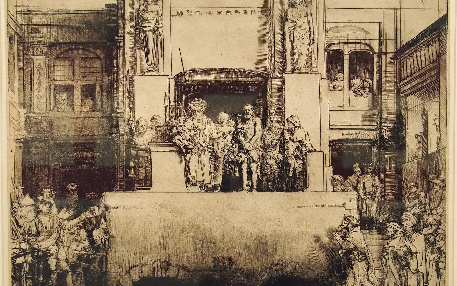
Christ Presented to the People (B. 76) and the large Passion plates offer some of the clearest evidence. Impressions on Japanese paper of these subjects survive in major print rooms and differ visibly from their European-paper counterparts: the atmospheric depth of the shadowed architecture, the way faces emerge from backgrounds without hard outlines, all read differently on the warm sheet.
The Rijksmuseum holds important impression groups that allow direct comparison, and the British Museum's online collection database records states and papers together, making it possible to track how Rembrandt distributed paper choices across states.
Because the fibres are finer and more compressed, the ink sits with slightly less spread — the finest lines hold their crispness better.
The Three Crosses (B. 78) is a particularly studied case. In its later states, where Rembrandt reworked the plate with sweeping drypoint strokes, some impressions were pulled on Japanese paper with a warm plate tone — unevenly wiped ink left on the surface — so that paper tone, plate tone and burr velvet combine into something almost monochromatic and suffocating.
No single technical decision produces that effect; the paper is one layer of a deliberate stack.
The scholarship
Frits Lugt's systematic work on impression quality in the early twentieth century drew attention to paper as a critical variable rather than incidental carrier. More recently, conservation scientists at the Rijksmuseum and the Rijksdienst voor het Cultureel Erfgoed
cultureelerfgoed.nl) (Cultural Heritage Agency of the Netherlands) have used fibre analysis and X-ray fluorescence to confirm the East Asian origin of sheets in specific impressions, moving the identification of "Japan paper" from visual assessment to physical evidence. The long fibres are diagnostic; European rag paper cannot replicate them.
No single technical decision produces that effect; the paper is one layer of a deliberate stack.

